Here are some of my mock-ups ideas, they are still a “work in progress”:
- Black and white, this mock-up helps with visualizing the overall layout of the website and to see what work and what doesn’t.


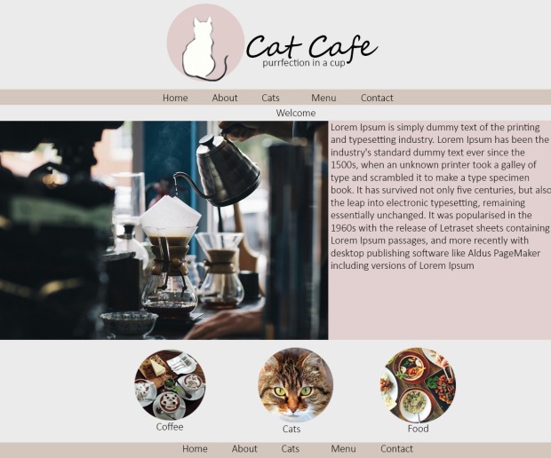
2. This mock-up has the layout and colour scheme, but the logo is different.


3. This mock-up is similar 2, but the the layout is different and colour is different. P.S the background colour is supposed to white not grey.

Hi Shyna,
You mockups are really nice, and I really like the idea of a Cat Cafe. I think you should consider adding a lot more padding to create more white space, it would make the layout look less crowded and therefore nicer to look at. I would also suggest not having the exact same menu in the footer as in the actual navigation bar, as you would usually need other things in the footer as well, directions, contact details, copyright etc.
LikeLike
Hi Shyna,
These are some great mock ups you have created. I can really imagine the second design really coming to life in a website. It has a nice choice of colour and a simple, yet not too crowded layout. The choice of using light pinks and light browns should really suit the theme of the cat cafe. My suggestion would be to perhaps include more padding around the main text as there is not much separation between the image and the text. This could make your website seem too cluttered. Adding a sufficient amount of padding to your elements should make your website seem cleaner and more organised. I like how you have included two navigation bars for easier navigation around your website. It would look really great if these two navigation bars were evenly parallel to each other as it will tie in the whole page nicely. Another thing I would also include is a good font that is easy to read but stylistic. I have used google fonts to find mine and I particularly like ‘Poiret One, Cursive’. This is quite a modern themed font that I think would also suit the style and content of your website. Other than that, I think your design is coming along very nicely and it should translate into a great website! Good luck!
LikeLike
Hey! I really like your mockups. Well done. Just an idea is that instead of having a menu at the bottom, you can add local link for the top of the page. If you consider this, here a link of how to do it: http://www.w3schools.com/html/html_links.asp. Also, maybe keep it more simple when it comes to the background color on text or the border lines. It looks cool, but maybe have some text that is without any decoration. Well done!
LikeLike
This is looking good! I really like the colours you’ve selected. I think the best one out of these is the last one. I think the colours suit really well together and the website being full screen looks really good. I actually like the colour grey with the tan brown, i think it works really well. It even makes me feel relaxed which is good if that’s the kind of feel you want to have. If you do decide to go with the other designs, maybe decrease the colour of the pink so that its a bit lighter (don’t change the colour, maybe just the opacity). With the black and white mockup, I feel that it’s a bit strong and it doesn’t really look that good (to me), but perhaps if you used like a grey instead of black which is a really harsh colour, it could be really good. I hope this helped! You’re doing a great job! Can’t wait to see how it turns out. 🙂
LikeLike
Hi Shyna! I’m really loving the feel of your first mockups. When I think of coffee and cats I immediately feel a sense of warmth or being at home aka at comfort, so I really like the calm, subtle, kind of pastel colours you used in your second batch of mock ups. I love your logo and how it incorporates coffee and cats in a simplified way to easily convey your shops name, and using the logo circle in conjunction to the circular links at the bottom of the page, that to me makes the circles seem less random and tie in nicely with your overall website. My only concern is you having two menu’s (top and bottom of some mock ups) unless its just a substitute for your footer. Other small things include spacing between the text and images, but I’m sure you can easily fix this as you start to build your site. Overall a great website! 🙂
LikeLike