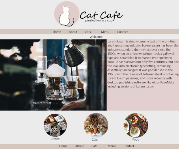
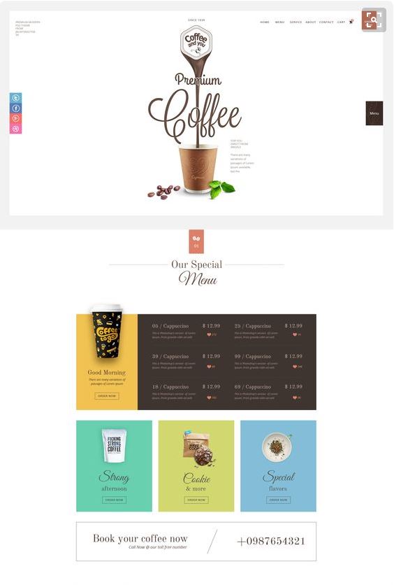
Here are my final mock-ups and this is also the design I went with for final website:


Here are my final mock-ups and this is also the design I went with for final website:
Firefox:


Google Chrome:


Internet Explorer:


For my second assignment, my website is a cat coffee shop. This coffee is shop provides fabulous food and cute cats. This website is comprised of five-page a Homepage/index, an about page (quality of the ingredients used in the food and beverages. How the company started and the story of the company), a Menu page (it will be divided into two sections beverage and food. What coffee shop sells and the prices of the products. Cats (the names, personalities, and appearances of the cats. The quality of the living for the cats and how they are treated), Contact page (phone numbers, location/map, and email address).
My client is a couple who own an up-market cat coffee shop business owner. They want to create a web-site to promote their business. The target audience is up-market “hipsters”, who like both coffee and cats. They are also comprised of university students, older couples and people who work in the city. I branded this website in a hipster, young and fresh approach that related to both coffee and cats. The style of the website is modern with pastel colours.
The colour scheme I went for are browns, whites, blacks, and pinks. I chose this colour scheme because it related to the context of the website (coffee and cats). I also chose this colour scheme because I think it highlights and compliments the imagery and illustration of the website. The font I went is Segoe Script regular for the heading because it looked modern and gave the website a ‘cutesy’ look. The font for the content and other important text is Calibri because it made it was read and understand. For the images and illustration, I used were circular, this related the logo and coffee stain at the bottom of a mug. This also gave a Morden look and brought more unity to the page.
The technical issues I ran in too was trying to create a gallery in my cat’s page to showcase their personality and what they look. Each time I tried it wouldn’t go into the centre on each picture would not line up properly. Another technical issue I ran into was taking picture of the cat and coffee/food. Each time I tried to take a picture of her, she would run away or move suddenly. This was also a limitation because I have to use copyright free images off the internet.
Reference List:
[Untitled photograph of a coffee machine]. (n.d.). Retrieved May 29, 2016, from

[Untitled photograph of a cats]. (n.d.). Retrieved May 29, 2016, from
https://pixabay.com/en/photos/cat/
[Untitled photograph of a cats sleeping]. (n.d.). Retrieved May 29, 2016, from
https://pixabay.com/en/photos/cat/
[Untitled photograph of a cats sleeping]. (n.d.). Retrieved May 29, 2016, from
https://pixabay.com/en/photos/cat/
[Untitled photograph of a cat face]. (n.d.). Retrieved May 29, 2016, from
https://pixabay.com/en/photos/cat/
[Untitled photograph of a cat face]. (n.d.). Retrieved May 29, 2016, from
https://pixabay.com/en/photos/cat/
[Untitled photograph of a cat face]. (n.d.). Retrieved May 29, 2016, from
https://pixabay.com/en/photos/cat/
[Untitled photograph of people taking notes and drinking coffee]. (n.d.). Retrieved May 29, 2016, from https://www.flickr.com/search/?text=coffee%20machine
[Untitled photograph of siliohette of a cat]. (n.d.). Retrieved May 29, 2016, from https://www.google.co.nz/search?hl=en&authuser=0&site=imghp&tbm=isch&source=hp&biw=1366&bih=643&q=cats+&oq=cats+&gs_l=img.3..0l10.183.618.0.2984.5.3.0.0.0.0.1057.1057.7-1.1.0….0…1ac.1.64.img..4.1.1056.rvlOYxZLb4s#hl=en&authuser=0&tbs=sur:fmc&tbm=isch&q=cat+silhouette+white
[Untitled photograph of a cafe interior]. (n.d.). Retrieved May 29, 2016, from https://www.google.co.nz/search?hl=en&authuser=0&site=imghp&tbm=isch&source=hp&biw=1366&bih=643&q=cats+&oq=cats+&gs_l=img.3..0l10.183.618.0.2984.5.3.0.0.0.0.1057.1057.7-1.1.0….0…1ac.1.64.img..4.1.1056.rvlOYxZLb4s#hl=en&authuser=0&tbs=sur:fmc&tbm=isch&q=cafe+interior+
[Untitled photograph of a cat coffee art]. (n.d.). Retrieved May 29, 2016, from
https://www.google.co.nz/search?hl=en&authuser=0&site=imghp&tbm=isch&source=hp&biw=1366&bih=643&q=cats+&oq=cats+&gs_l=img.3..0l10.183.618.0.2984.5.3.0.0.0.0.1057.1057.7-1.1.0….0…1ac.1.64.img..4.1.1056.rvlOYxZLb4s#hl=en&authuser=0&tbs=sur:fmc&tbm=isch&q=cat+coffee+art&imgrc=VwWhYR_NmLVwHM%3A
[Untitled photograph of pancakes]. (n.d.). Retrieved May 29, 2016, from
https://www.google.co.nz/search?hl=en&authuser=0&site=imghp&tbm=isch&source=hp&biw=1366&bih=643&q=cats+&oq=cats+&gs_l=img.3..0l10.183.618.0.2984.5.3.0.0.0.0.1057.1057.7-1.1.0….0…1ac.1.64.img..4.1.1056.rvlOYxZLb4s#hl=en&authuser=0&tbs=sur:fmc&tbm=isch&q=pancakes
[Untitled photograph of oats]. (n.d.). Retrieved May 29, 2016, from
https://www.google.co.nz/search?hl=en&authuser=0&site=imghp&tbm=isch&source=hp&biw=1366&bih=643&q=cats+&oq=cats+&gs_l=img.3..0l10.183.618.0.2984.5.3.0.0.0.0.1057.1057.7-1.1.0….0…1ac.1.64.img..4.1.1056.rvlOYxZLb4s#hl=en&authuser=0&tbs=sur:fmc&tbm=isch&q=breakfast+food
[Untitled photograph of food ]. (n.d.). Retrieved May 29, 2016, from https://www.google.co.nz/search?hl=en&authuser=0&site=imghp&tbm=isch&source=hp&biw=1366&bih=643&q=cats+&oq=cats+&gs_l=img.3..0l10.183.618.0.2984.5.3.0.0.0.0.1057.1057.7-1.1.0….0…1ac.1.64.img..4.1.1056.rvlOYxZLb4s#hl=en&authuser=0&tbs=sur:fmc&tbm=isch&q=food
[Untitled photograph of chips and dip ]. (n.d.). Retrieved May 29, 2016, from https://www.google.co.nz/search?hl=en&authuser=0&site=imghp&tbm=isch&source=hp&biw=1366&bih=643&q=cats+&oq=cats+&gs_l=img.3..0l10.183.618.0.2984.5.3.0.0.0.0.1057.1057.7-1.1.0….0…1ac.1.64.img..4.1.1056.rvlOYxZLb4s#hl=en&authuser=0&tbs=sur:fmc&tbm=isch&q=food
In terms of this next assignment, I want to focus more on the design side since I now have more experience using .html and .css. My website will be a cat cafe shop, with pages dedicated to cats, a menu page, etc…
I have looked into some site design principles to help me when I start my wire frames and mock ups for every page.
The navigation of the website is one of the most important part of any website, it makes it easier use and navigate through. This the main way the audience uses the website and looks around.
Planning site navigation:
Effective navigation:
It not only about providing links to pages, but includes cues to where the user are presently . The user should be able to answer the following:
There are number ways navigation should be done:
The theme of the website can send out different “vibes” of how the organisation/client is portrayed or what the website is about. The themes and layout of a website are the most important aspect of any website (excluding content). In this assignment I have to create a website that is about a cat cafe. The theme I’m going for is minimalist with soft ‘muted’ colours and also a hipster/up-market design (professional). Most of theme that they I have looked at all relate to coffee or cafe website and also restaurant website.
Here are some example of themes for website:
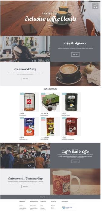
The theme of this website is minimalist, with a monochromatic colour scheme. The website also looks very “hipster” and “up-market” design. The minimalist design/theme highlight what is most important in website (the written, prices, food labels, etc.). It also highlights the images by making the images at foreground and background of the website.
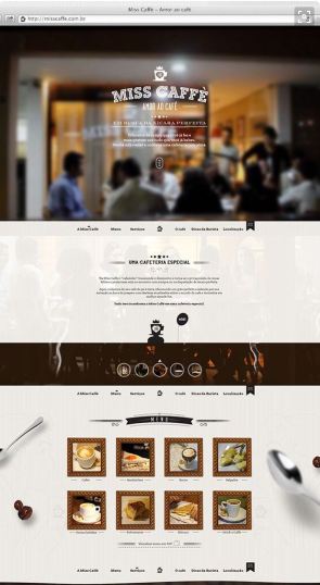
2. Miss Caffe
This website uses a lot of imagery and illustrations for their web design. What I really like about this website is the colour scheme, the browns, golds, black, creams and whites. I think this relate to the what the website, which helps the viewer/audience understand what the website is about. The theme of the website is minimalist, this also highlights the images and illustrations used, by making it the priority of the website.
Take a closer look at the website:


Here are some of my mock-ups ideas, they are still a “work in progress”:


2. This mock-up has the layout and colour scheme, but the logo is different.


3. This mock-up is similar 2, but the the layout is different and colour is different. P.S the background colour is supposed to white not grey.
White space is key in the layout and design of the website, it could make or break a website. For this assignment my design will have a lot of active white space, to help separate content and make it easier to navigate through.
What is white space?
White space, in many times is called negative space or active space. This is the portion in design (website) that is left blank or is unmarked and empty. In web design, it’s the space between graphics, columns, images, text, margins and other element. It is the space left untouched in order to smooth things out and transform a page into something elegant. It is also the blank space that reminds us that simpler designs are beautiful and that we don’t need to create a layout filled with text and graphical elements to deliver a clear and direct message.
Active white/negative space is used to:
A lack of active white/ negative space leads to imparting an impression of:
For example:
This website has a lot of white space, which helps with separating the content (improves readability) and guides the user’s eyes. By also have white space it makes the images and content the focal point of the website, by making it pop and highlighting. The website overall theme is very minimalist, by creating white it keeps website looking clean, elegant and fresh (youthful).
For this assignment I have been looking for inspiration relating to coffee shop/cafe design. I have been looking at colour scheme, layout, content and overall look/design of the websites. Here are some website design that caught my eye:
This website caught my eye because of its use of imagery and photography. I also love the layout of the website, its simple and easy to navigate through. l like the placement of the navigation bar, which is in the centre top this makes it easy to navigate through the website and see. I also like how all the content is the centre rather than left align, this give a fresh clean look where not everything is clustered and has more white space. I also liked how they used illustrations for their logo and symbol, this makes it easier for the audience to understand and read. The colour scheme of the website is black and white with a hint blue in the logo and search bar. By using the a black and white colour scheme it makes the images pop and highlights what they are trying to sell.
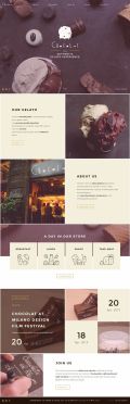
2. Chocolat
This website has given me inspiration about colour scheme. The colour scheme of this website is monochromatic and with pop of pastel yellow. It relates to content and images, which is chocolate gelato. I also thinks this colour scheme give it a hipster and upmarket type of feel (where ice-cream cost $10 per scoop). I like how the colours are incorporated into the logo, this gives the website unity. I also like the minimalist theme of the website, by just have large photographs and minimal written content. This makes it more easier to understand what the website is about and less boring. There is a lot of negative space/ white space, this makes it easier to navigate around and read.
3. The Gourmet / Tasty
I love this website design, colour scheme and overall layout. The colour scheme of the website is black and white, which makes the images and photography pop. I also love how the images are the main attraction of this website. This gives a clean, fresh and “modern” look. Another aspect that I like about this website is layout of the website, from making the content be centre align, this gives the opportunity for white/negative space which helps with the navigation of the website. The theme of the website is minimalist, by have little written content but a lot of images and photographs. I really love this website overall design and I might incorporate it into assignment 2.

Take a closer look at the images above:


